We’re happy to get feedback from our users, as it lets us know where we need to improve Respresso. Now, we collected some of the updates that were inspired by our users. (You can also submit a feature request here or send us your feedback directly to info@respresso.io) Let’s see them.
Zeplin integration
In addition to our Figma and Adobe XD integration, you also requested Zeplin support. If you know Zeplin, you may have noticed that it has no interactive integration options. This is why we had to be very creative.

We created a Zeplin extension that builds a WebSocket connection with our servers. Using this, you can interactively configure the import from the Respresso web app. Thus, it has the same capabilities as our Figma and Adobe XD integrations.
Curious? Get started here.
Performance boost – new HW & SW
As Respresso started as an in-house solution, we used spare resources to power the servers. This meant that sometimes it got annoyingly slow, but now, we changed this.
As a first step, we moved Respresso to dedicated servers, that have almost 4 times more computing power. This helps it handle large amounts of parallel requests, without slowing down.
More importantly, we sped up the execution of the Flow and some converters. This includes parallel execution of multiple processors within a single Flow. Also, sub-flows (eg.: single resource conversions) will execute in parallel.
⏱ Overall, these upgrades mean 2-8× faster response times for most conversions. (Eg.: Hitting the “Save” button).
Simplified interface for better UX
Sometimes developers are lazy to work on UX so they select an easy solution. We admit that we were also guilty for this reason. But we realized it and worked out a solution.
First of all, we added a large drag & drop area to simplify imports and uploads. Thus, you save 1 or 2 clicks and even file browsing.
We replaced the type selector in the import dialog with automatic type detection. This saves one more click for you.
One of the most popular features – the image upload – also needed a redesign. We replaced the ugly and slow upload dialog with inline upload progress. As a bonus, it now shows the overall progress instead of individual files. Also, it adds every image to the list as it finished the upload.
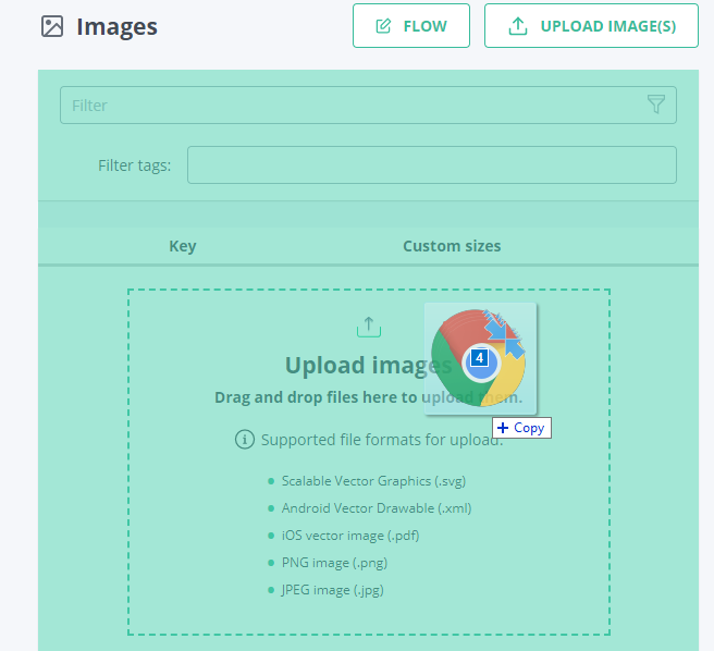
Localization variable import and other configs
Under the hood, Respresso can partially handle localization variables. This feature is present from the beginning but never surfaced on the UI. This meant that Respresso could import your variables but it never let you change them. To address this problem, you can now decide whether to import or ignore variables.
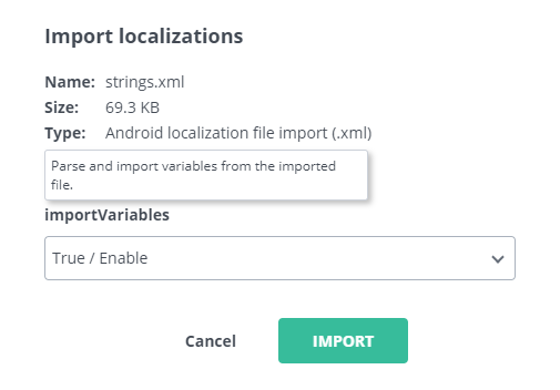
By adding this option, we opened up the possibility to add more config options for importers. Another example is the color import from images, where now you can choose how many colors you need to import.
Spreadsheet (.xlsx) localization import
Silently we added another localization importer for .xlsx spreadsheets. For now, it lets you import only a specific structure.
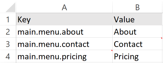
If you’d like to see a more customizable importer, just let us know it.
Simplified sign-up and quickstart setup
Respresso’s main goal is to save time. This is why we decided to revisit our onboarding process and drastically simplify it.
We added GitHub and Google sign-up options to let you skip the boring part. Like typing your name and email, passing the captcha, and the email verification step.
For email sign-up, we switched to the invisible reCaptcha to save you even one more click.
We went further, so you don’t even need to name your first team and project as it’s automatically created for you.
Interactive in-app tours and hints
We were really disappointed when we found that some of our users never get to the point to hit the save button. This is why we added interactive in-app tours that help you try the basic features.
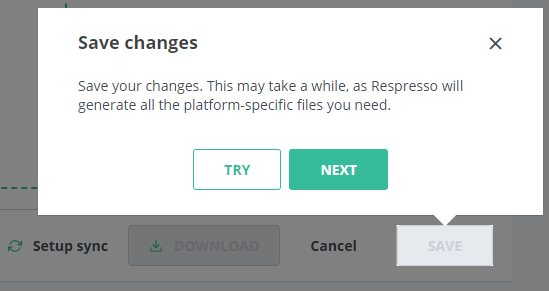
We added a bunch of hover to show hints to help you and your team to get used to Respresso. This includes a simple description of the feature as well as some best practices.
Sync client setup guide and tutorials videos
As we see, automation is key to efficiency. This is why we made our sync clients (android, iOS, and web). They are capable of automatically updating your project resources.
Although these save a lot of time, only a few teams use them. To change this, we added a setup guide to Respresso and we created step-by-step video tutorials. These replaced previous popup guides to streamline your experience.
Simplified version management
We found that most of you don’t use Respresso’s version manager. This is why we wanted to simplify that for you. Instead of removing a useful feature, we decided to hide it from the basic users. From now on, Respresso will automatically open the proper version. This saves you a click each time you open a category. ?

Also, you will find an “Open version manager” link in each category. Thanks to that, you can still manage multiple versions, but we don’t bother those who don’t.
Long-awaited role management
Just like every other collaborative tool, Respresso also needed role management. Last year we finally added proper permission handling on team and project levels. This lets you give only the necessary rights to each user. Eg.: you can limit your client to edit only contents (eg.: translations), so they can’t mess up your keys.

What’s next?
It depends on you. We want to make Respresso the go-to solution for resource management but we need your feedback to do so. If you have a suggestion, let us know at info@respresso.io or submit a feature request here.
We really need some attention to help us continue our work. If you already like Respresso, and you’d like to help us, please share it with your colleagues.


